Color has a funny way of making you feel certain emotions. Each part of the color wheel has a different purpose and its goal is to help those in the area feel a certain way. Therefore, you should choose various color schemes for your house, depending on how you want others to feel. When considering painters in Overland Park, think about each room and how it should be set up. For instance, here are some colors you should steer towards and stay away from by home painters in Overland Park.
Dining Room and Kitchen
The colors used in these rooms should evoke appetite and energy. You see it in restaurants all the time for a reason. Warm tones tend to make people linger, talk longer, and enjoy meals a bit more.
Reds and yellows are common choices. They feel warm. They feel inviting. They make the room feel active without being overwhelming if used correctly.
That said, it doesn’t mean every kitchen needs to be bright red. Even softer versions of these colors can create the same effect. Warm neutrals, muted golds, and earthy tones still bring that same feeling without dominating the space.
A lot of homeowners who start looking into house painters in Overland Park are surprised how much the finish and tone matter just as much as the color itself. Matte, satin, or gloss can shift how bold a color actually feels once it’s on the wall.
Bedrooms
Bedrooms are the opposite of kitchens. This is where you go to shut everything down.
Bright reds and harsh yellows tend to work against that. They can feel stimulating when what you really want is calm.
Blues, greens, and softer earth tones tend to work better. They feel quieter. They don’t pull your attention. They help the room settle down.
That’s why many homeowners rely on interior home painters in Overland Park to help dial this in. It’s not just picking a “nice” color. It’s picking one that actually fits how the room is used.
Even small changes, like going a shade lighter or less saturated, can change how the space feels at night.
Office Space
Home offices are a little different. You don’t want them too relaxed, but you also don’t want them distracting.
Blues and soft whites are popular because they feel clean and focused. They don’t compete for attention. They just sit in the background and let you work.
Darker tones can work too if the space has enough light. They can make a room feel grounded and less chaotic.
Colors like bright orange or intense red tend to do the opposite. They can feel tense over time, even if they seem exciting at first.
Most home painters in Overland Park will tell you the same thing: if you’re second guessing a bold color for a workspace, you probably already have your answer.
Hallways, Bathrooms, and Smaller Spaces
These areas don’t always get much attention, but they should.
Hallways benefit from lighter colors that make the space feel more open. Bathrooms can go either direction depending on lighting. Some people prefer bright and clean. Others go darker for contrast.
Smaller rooms are where color mistakes tend to show up the most. A shade that feels fine in a large space can feel heavy in a tight one.
This is where working with the best interior home painters in Overland Park can help avoid repainting the same room twice.
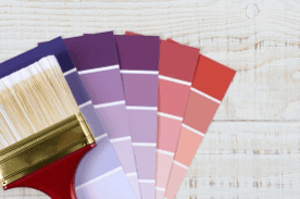
Why color choices don’t always translate from samples
Paint chips don’t tell the full story.
Lighting changes everything. Natural light, overhead light, even the direction your windows face can shift how a color looks throughout the day.
A gray might look warm in the store and cool in your home. A beige might lean yellow once it’s on a full wall.
That’s why testing samples on the wall matters. Not just one coat, but enough to see how it actually settles in the space.
Tying the whole house together
Every room doesn’t need to match, but they should make sense together.
Transitions between rooms matter more than most people expect. Walking from a bold room into a calm one should feel intentional, not abrupt.
A lot of this comes down to undertones. Keeping those consistent across rooms helps the house feel connected, even when colors change.
This is usually part of the conversation when working with painters in Overland Park. It’s not just room-by-room decisions. It’s how everything flows once the doors are open.
FAQs
Do I need to follow color “rules” for each room?
Not strictly. They’re more like guidelines. If you like a color and it works for how you use the space, that matters more than sticking to a rule.
Should I choose paint before or after furniture?
Usually after. It’s easier to match paint to furniture than the other way around.
How many colors should I use in a house?
Most homes stick to a small palette and vary shades from room to room. It keeps things consistent without feeling repetitive.
eady to get started? Reach out to us online at Residential Solutions to fill out a form or call us at (913) 522-9004. We help homeowners. We help neighbors. We help people bring their homes back to life.
We listen. We repair. We paint. We make your house feel like home again.
Would you like to discuss your next project?
We are here to assist you with addressing wood decay, paint refreshment, and expert restoration. ![]()
Follow us on Facebook for updates, project highlights, and tips to keep your home looking its best.

